Are you a Quiet Speculation member?
If not, now is a perfect time to join up! Our powerful tools, breaking-news analysis, and exclusive Discord channel will make sure you stay up to date and ahead of the curve.
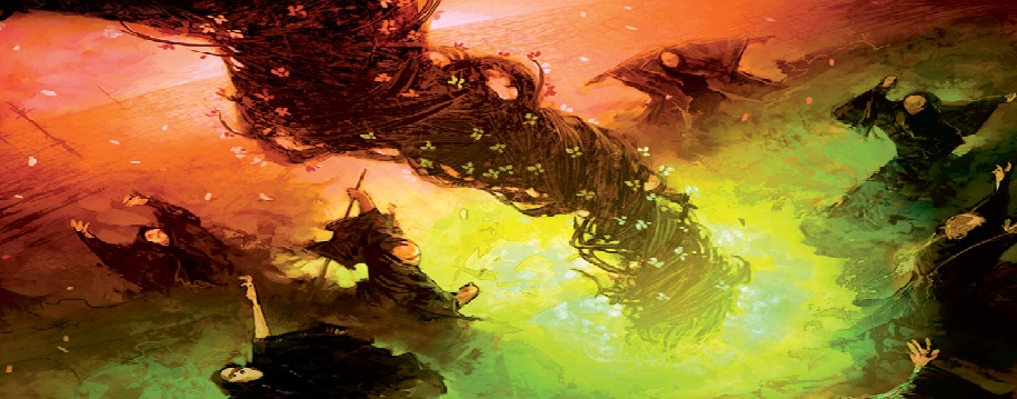
As promised in last week's article, this week we will delve into the world of foils and how best to alter them. I will also fill you in on how you can get a hold of the cards that are shown in today's article. Business before pleasure though, we have a lot to cover.

The first and most important thing you need to know about altering foils is that foil cards do not accept the paint as well as normal cards. That shiny exterior does not allow the card to absorb the color. This can be a good thing though, you will notice that your colors are marginally more vibrant.
It's also important to note that throughout the years, wizards has changed the process by which they create foils. If you are new to the game you may not know that foil cards used to only have foil borders, the picture remained unchanged. If you choose to alter an old foil then you need to take this into consideration. Newer foils are of course completely shiny-ified so we at least have a consistent surface to work from.
This may seem obvious, but the areas where you have painted will be much easier to spot on a foil card. We must consider this when planning our project. As stated last week, we want to keep the paint to a minimum while maximizing the impact of the alter, so an accent piece is the best way to go in most cases. For today's project I have chosen an Oxida Scrapmelter, though as I know, many of you may not have one of these at home. If you wish to play along with this tutorial, any foil card with fire in the artwork will do.
FIRE!

The first step is always to lay a base coat, but as we are working on a new medium, there is a slight change to this step. No matter what color you plan on using, a white base coat is always advisable. This allows the next coat to have a firm grip on the card. Also make sure to allow more than ample time for each coat to dry. It is entirely too easy to smear paint on a foil before it dries completely. That said, this provides a very good opportunity to start or finish another project while you wait.
Once that has dried you may now lay down your first true base coat with the basic colors of the chosen design. For myself, I used a touch of Brilliant Orange for the areas of fire that will be darker and continued with white in the lighter areas. Remember that yellows and oranges do not cover very well, so err on the side of caution in terms of how dark you want to go. It is easy to go darker, not so easy to go lighter. I also used a sort of rounded “swish” stroke so that any texture on the card will hopefully enhance the idea of blown flame.
After allowing ample amount of drying time once again, its time to add some of the real colors here. The outer parts of the flame may look like a deep orange, but in reality I used straight Naphthol Red on top of the orange I had laid down first. I worked my way inward from there by mixing Brilliant Orange with the red and gradually getting lighter with Titanium White. No tricks, no gimmicks, this was an easy one. Although it doesn't show in the picture, the colors matched up perfectly. We have, however, come to the last thing you need to know about painting foils. The colors on the card change due to the angle at which the light in the room hit the card. It is ultimately impossible to exactly match the colors on a foil card, the best we can do is find a median that looks good in most lights and go with it.

I wasn't entirely happy with how the fire ball looked. I felt the shape was too round and obtuse and I also felt that the fire needed some depth. I solved the shape problem with my trusty toothpick, giving the flame a more sleek shape, as if it were being propelled rather than just belched out randomly.
I then used a Mars Black in conjunction with my previous orange mixture and painted a shadow around the outer part of the fireball to add some depth. I did not clean the edges of the shadow as I thought it looked a little more “burnt” that way. Critics will say that the text is visible under parts of the fire, to which you should always reply “Fire is not opaque”. Lastly, I decided to try and disguise the alter a little more by carving out some spots in the fire ball where the original foil can shine through. I found I was ambivalent about the end result, but it is something to consider in the future, or maybe suggest to a client.

Waffle Time!!
Sorry about the typo above, it should say “Raffle Time” but I'm getting a bit hungry as I write this, so I think it's time I told you about the raffle. The more this column grows, the more feedback I require to keep it growing. Also given what I stated last week about building a community, it is only right that I provide some sort of a forum to plant that seed. So I invite you to submit your name to the raffle in any or all of the following ways:
Follow me on Twitter
Like “The Painters Servant” facebook page
Leave a comment here on QS
Email me
The Rules
You get one “ticket” for any and all avenues you use to leave feedback. You must leave useful feedback, not just “good article”. Anything from suggestions on how to improve the article (Format, length, more pictures, less pictures etc.) to painting techniques will do. If you already follow me on Twitter than you have already qualified.
Please try to use the same or similar screen names if you want multiple tickets or notify me with any notes on who is who. I should also note that as I don’t know any of them personally, QS authors and editors are also welcome to enter, but will be shown no favor. All entries must be submitted/joined/emailed/tweeted/liked by June 19th.
How to Win
I am literally writing down names and drawing them from a hat. If you win, I will contact you in (one of) the methods that you chose to enter for your contact information. You're contact information will not be sold, used, or given to anyone else past sending you your prize.
Prizes
 Set of foil Lightning Bolts (pictured)
Oxida Scrapmelter (pictured)
Cancel (pictured)
Other prizes will be awarded if I'm feeling particularly generous at the time and could be, but are not necessarily guaranteed to be, altered cards or unaltered rare and foil cards.
I wont hold you back any longer, get to it!
-The Painters Servant
Twitter: PaintersServant
Email: Mbajorek02@gmail.com
first? woot
The lightning bolts look odd, like the white doesn't match. Is that because the bolt itself is actually clear through to the foil, or is that an artifact of the scanning/photo?
If the bolt's clear through to the foil, is there a reasonable way to remove the ink from the textbox to achieve the same effect there as well?
I agree with Josh in principle, but with the Scrapmelter instead. The center ray of fire looks rather off, hurting the whole dynamic of the alter. Too much orange, not enough yellow/white.
One technique that is sometimes discussed on MTGSalvation is the sanding of paint off of the card and painting the edges surrounding it.
The alters in this article are too subtle, but that's just my taste. Didn't even realize the cancel was altered until the very end.
I couldn't find the Facebook page, so I figured i would comment here instead. I really like this series on alters even though I'm brave or skilled enough to try and alter cards myself. And more pictures is always good, I love to see the both the finished project and how it gets there!
I'm going to second Corbin's suggestion: the more pictures I see of the process, the more I can imagine what it's like to do the alteration and the more insight I get into the process. Despite a lack of artistic ability, I find this series fascinating. Looking at alters is cool, but 'watching' them get made is even more so.
An engineer's electric eraser and eraser guard http://www.byrnerobotics.com/forum/uploads/JohnBy… might make that process easier.
I love reading alters, but it's just not for me. I suggest that at the bottom of each article you have a list of helpful links for beginners or base articles you have written. An article about paint selection, pros and cons, minimum colors, an article to get someone who has no artistic talent whatsoever to get started making mistakes and get better. I currently have some waterbased pains, but im finding it pretty bad, way too many layers needed to pain stuff, and I cant find an article to help me out. Love the artwork you do. Thank you.