
Are you a Quiet Speculation member?
If not, now is a perfect time to join up! Our powerful tools, breaking-news analysis, and exclusive Discord channel will make sure you stay up to date and ahead of the curve.
If you read my last article and decided to come with me on this artventure, then you should have picked up the items on my list that are necessary to start altering cards.
This week I'll begin a step by step tutorial on altering a land. As this is our first tutorial together, I want to make sure that I don't gloss over anything.
I've been doing this for five years, so it might be easy for me to just power through with all of the shortcuts I've developed over the years, which isn't beneficial for someone who is picking up a paint brush for the first time.
This guide became so long due to the extra details that I've decided to split it into two parts. After this two part tutorial, every altering guide will be completed in one article, with more business related articles sprinkled in between them.
So I'd like to ask all of you financiers to either paint along or hang with me for just a bit! For those of you really looking for a financial bit to chew on over and above increasing the value of a basic land this week, take a peek at Rattleclaw Mystic.
This card has been getting a small amount of buzz as a hot pick up before rotation, as Sylvan Caryatid and other mana dorks rotate. Just watch out for a Birds of Paradise reprint in Magic: Origins.
Also, I'll be painting one of these in a coming article, so it might be wise to pick one up anyway!
Onto the Show
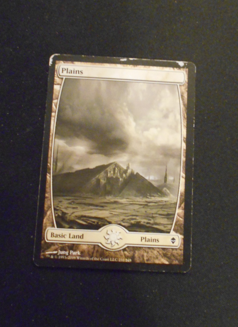
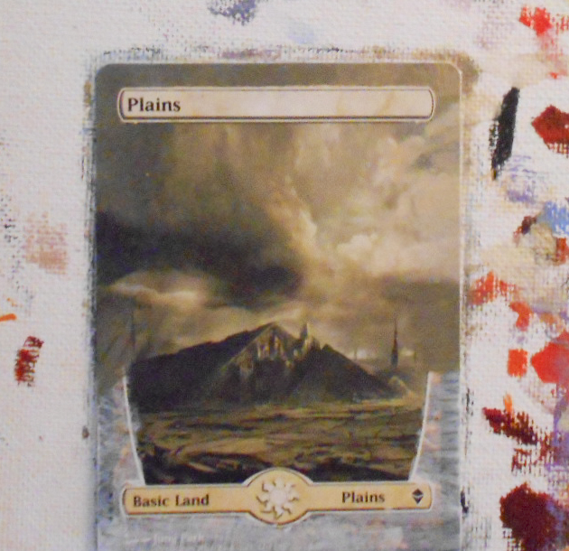
As you can see here, we have a basic Plains from Zendikar.
These are nice pieces to find in bulk lots or throw-ins for a trade, but this one is a bit beaten up, making it almost worthless.
These are prime targets for rehab by altering!
First Thing's First
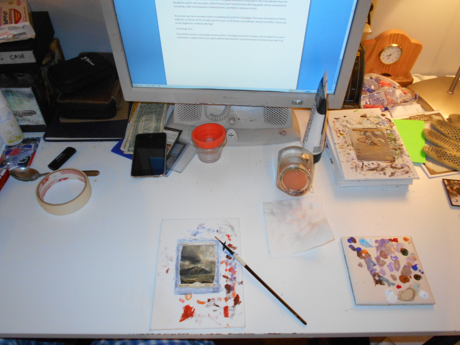
You need to set up a reasonable area to work in. You don't need a lot of space, just enough for a cup of rinse water, a paper towel, your paint palette and whatever you have chosen to mount your card to.
Mount your card on your board with masking tape or scrapbooking tape.
Open up your white paint and put a small drop of paint on your palette. You don't need much. The drop should be smaller than a pea and you won't even use that much.
Take your paint brush and dip it in the water, then wipe it on the paper towel. This is to remove excess water, but you still want a wet brush. The moisture on the brush will help to thin out the paint. This is extremely important, as paint can build up rather quickly, making a card unplayable even in a sleeve.
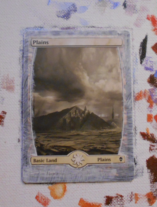
Use your brush to pick up a small amount of white paint and begin brushing it on to the border of the card. Your stroke should be swift and even. Applying enough pressure to cause the brush hair to bend but not flatten to the surface.
As you work your way around the border of the card, take time to gain confidence in your brush work by experimenting a bit. Notice how the paint spreads. What happens when you add more moisture to the paint? Or less?
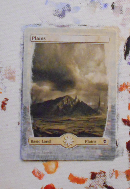
When you've finished, you'll want your card to look roughly like the picture here. The purpose of this priming layer is two-fold. First it allows the next layers of paint a more suitable surface with which to hold onto of the card. Second, it covers the original colors of the card and stops them from showing through and affecting the colors that we are putting down.
Making the Colors
It is important to note that not every card is the same.
Colors in a copy of our Plains may actually be slightly different. There are small variances in the amount of ink on a card that will change the overall vibrancy of a color and sometimes even change the colors themselves.
Try to picture how your book report looked when your printer started running out of a certain color. This happens to large scale printers as well and serves to make our job more difficult.
The beige and grays that dominate the color palette of this card are all made from three colors right in front of you. Mixing yellow and white, then adding small amount of black will create the different hues that you need.
Mixing paints is by far the hardest part of altering cards, but with some practice you can become proficient. I'll do my best to walk you through it, but a little experimentation and time spent playing in the paint goes a long way here.
Consider all of my instructions about color to have the additional text: Add Black or White to bring the color to the necessary hue to match your card.
I always work back to front, meaning objects in the background are painted before objects in the foreground.
In this case, the farthest most object is the sky. Cloudy skies can be tricky, but if you break them down, they become simple enough.
What we want to do here is start with our lightest color, which, in this case, is the pearl color off to the right. You can create that by adding a dab of yellow to your white paint.
Once you have a mixture that is close in color, apply it all the way around the border until you hit just below the horizon on either side. It does not have to be an exact match, just close enough to be believable.
Once you have done this, rinse your paint brush thoroughly and dry it on the paper towel.
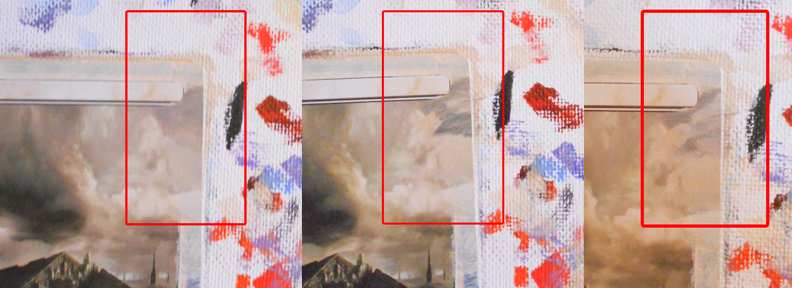
Here is where it gets touchy. Remember to wet your brush before continuing your work on the clouds to the right side (shown in the red box).
We want to achieve about three layers of color here. Attempt to match the clouds' colors. You can do this by using just a touch of black paint to bring the tone of the color you created down, or adding white to bring the tone up.
Be very careful--black paint will make things very dark. Very dark, very quickly. If you find that your mixture is too dark ,you can always add more of the yellow and white to bring the tone back up again.
Once you have a mixture that looks comparable to the color you are aiming for, pick up a small amount of paint with your brush and apply color lightly to the area. You'll want to overlap ever so slightly with your target area on the card so as to help give the illusion of blended colors.
Your brush stroke should be delicate and very short as you are working in a small place. As you go, try to continue the shapes made by the clouds. The artist (in this case, Jung Park) has laid the blueprint for your work--all you have is but to complete it.
Now add black to bring that tone down to match the low lights of the clouds. Those grey areas are very important for showing depth. Use that delicate stroke again to push those areas out from the original work and onto the border.
Do not be afraid to paint over some of your original color. This is an important thing to remember when painting something so nebulous as a cloud. We want to avoid having solid or straight lines. The brush does a lot of this work itself. Paint naturally wants to spread, which is why painting hard lines can be so difficult.
Adding white now and possible some yellow, we need to work out those highlights. This last layer is where your clouds will really start to take shape. Highlights are easy to over represent so start small and build up. As before, take the original shapes in the clouds and simply continue them.
On a slightly larger scale, follow this process as you work around the border. The dark clouds on the left have much less form than those on the right, so you should be able to handle a much larger area of them.
As you work, remember to overlap the original artwork here and there. This will help remove the border line that sometimes develops dividing the card and the paint. It also helps to trick your viewer into believing that this is all one piece of artwork and not just paint on a card. Human eyes are easily fooled, as we will discuss in the future.
Once you have completed the entire sky around the border, rinse your paint brush thoroughly and brush it along your paper towel. Continue to do this until the brush leaves no visible streak of color on the towel.
Your paint should be mostly dry on the surface, but it will smear if pressed. Now is the perfect time to use a toothpick to clean the name plate on the card.
Using the pointy end and very mild pressure, scrape the offending paint off little by little. I find this to be as enjoyable as peeling the plastic off of new electronics, but your mileage may vary. Regardless of how much cheap enjoyment you find, you should note that simply having a cleaner edge makes the paint look much better.
This brings me to the most important thing I have ever learned in art.
It Looks Awful Until It Doesn't
Often times you will find yourself painting three or four coats of color and just not feeling like things are coming out properly. "The clouds look a mess!" "That grass looks stupid!" "Ugh! Screw this, I'm going to play outside!"
When you find yourself thinking these things, remember how important it is that you push onward. Remember that the clouds on this card looked like a few layers of mud colored paint before you put the highlights in. How much did those highlights improve your feeling about what you have created?
Once you nailed that particular plume of cloud, did you have a sudden jolt of confidence?
Five years into this hobby, on this very card, I still feel exactly that. If you get too frustrated, then by all means take a break, but don't ever give up.
I'll be back next week to finish this project with you.

Very informative, Mike. Thanks for the insight!
This is exactly the series I have been looking for. Can’t wait for next week.
Quote: “I always work back to front, meaning objects in the background are painted before objects in the foreground.”
I want to bring this into special note for readers. Unlike drawing with pencil, you are not as able to remove and redo paint work. To have any great success, planning work from background to foreground (in layers as noted) will save many failures. The most noticeable errors are when you forget about adding a certain detail and just plop it in–this makes blending and edging near impossible to hide.
Think about building a house. Step 1 is laying the foundation, followed by framing, interior, then finishing. If you start with the roof, there will be no framing to attach it to… and no foundation to support the structure.
Thanks Enyeto! The house analogy also helps to show the points made in the last section “It looks awful until it doesn’t”. Laying the framework doesn’t always look good, but walls and a roof couldn’t exist with out it.
I appreciate the helpful comments here
I’m such garbage at mixing colors