
Are you a Quiet Speculation member?
If not, now is a perfect time to join up! Our powerful tools, breaking-news analysis, and exclusive Discord channel will make sure you stay up to date and ahead of the curve.
We Insiders are used to using Trader Tools (TT) to track individual cards, but looking at aggregate data could provide for some interesting analysis. Today I'd like to look at several selections of the available data to see what it can tell us about Magic finance. Let's have some fun!
Statistical analysis can be deceiving. First of all, it's only as good as the data set it's based on. For this reason I prefer to use buylist prices over retail prices. There have been issues with Trader Tools' retail prices in the past, and they may be unrealistic at times.
That doesn't mean that the buylist prices are perfect either, but I believe they're more representative. Thus all the numbers below are taken from TT buylist prices.
Ideally we would have perfect information on quantities sold and at what price, perhaps even augmented with information from the buyer on why they made the purchase. Unfortunately, real data is rarely this complete. I have tried to interpret the graphs presented below with a critical eye, and I will take you along in my thought process—but remember that there's no substitute for doing your own thinking.
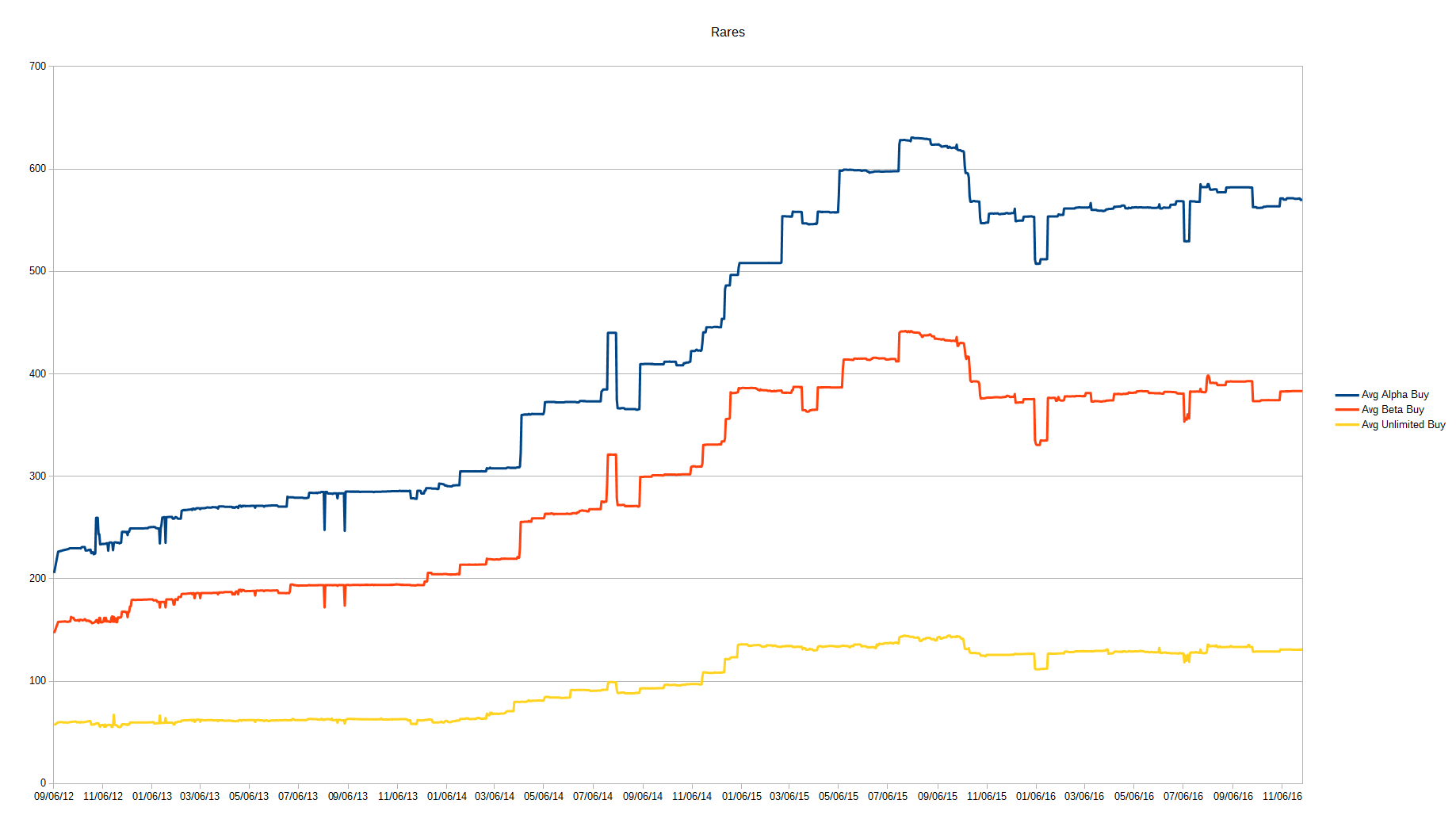
Alpha, Beta & Unlimited
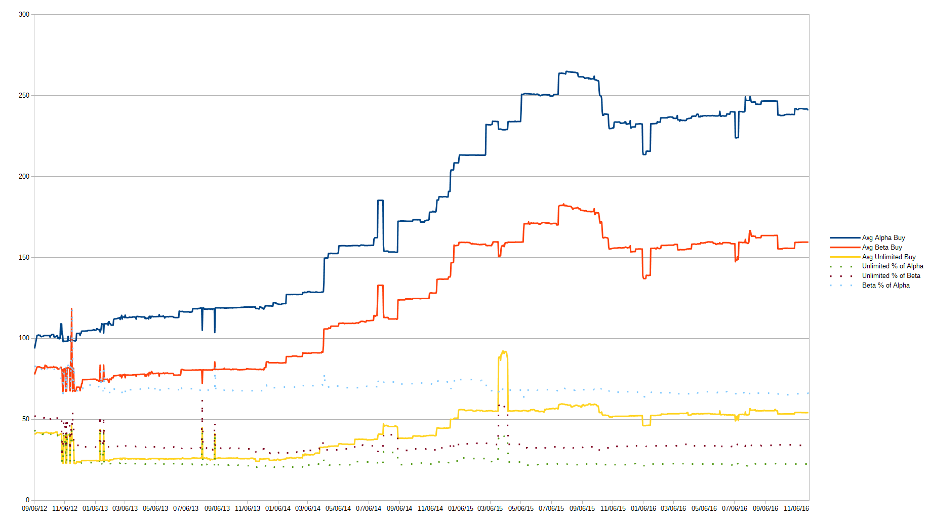
There are a few exciting things to note here. First of all it appears that Alpha, Beta and Unlimited behave very similarly—when the average price of one set rises or drops, so do the others. It's not a perfect relationship, but on the whole we can conclude that one of these sets could be an indicator for the other two.
It gets even more interesting when we look at each set price as a percentage of the others. If we discount the first few months of data, Beta is consistently worth roughly 65-70% of Alpha; Unlimited is 30-35% of Beta; and Unlimited is 20-25% of Alpha.
Another thing we see is that around January 2014 all three sets started rising, continuing until around July 2015. After that there was a bit of a drop and then new stability.
Looking back at a discussion on the forums in 2014—particularly this comment and later responses—it would seem that at the time a number of people were picking up Power and pushing up the prices. Given that Power and a few other high-end cards make a larger contribution to the average price of cards in these sets, it makes sense to see the graph align with, for example, Black Lotus.
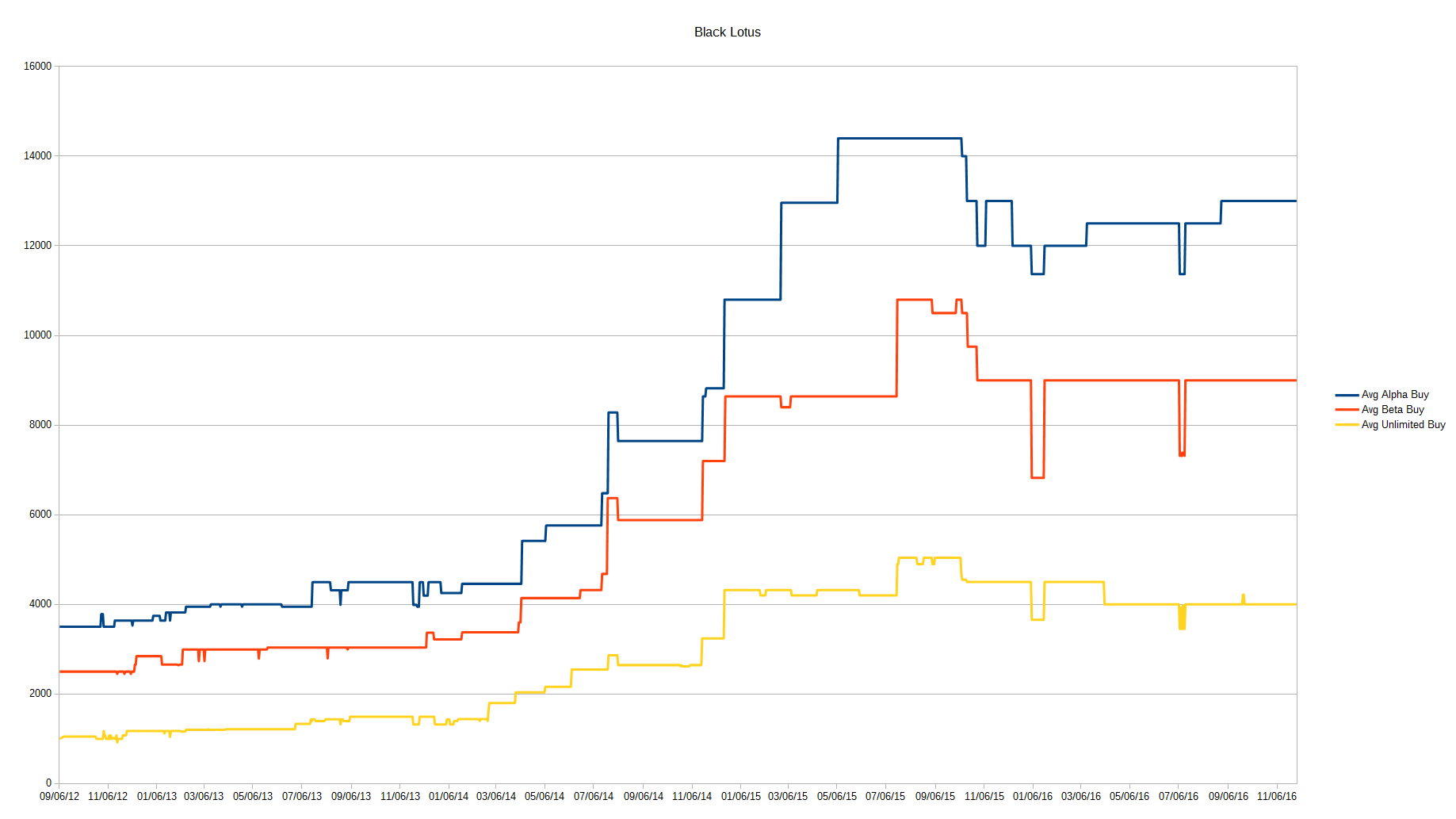
Indeed, if we look at the behavior of Black Lotus's price during this time we see a very similar pattern. In fact, we may be seeing an issue with our data here: what if a certain subset of cards has too large an influence on the total? Let's look at the same data, but split by rarity.
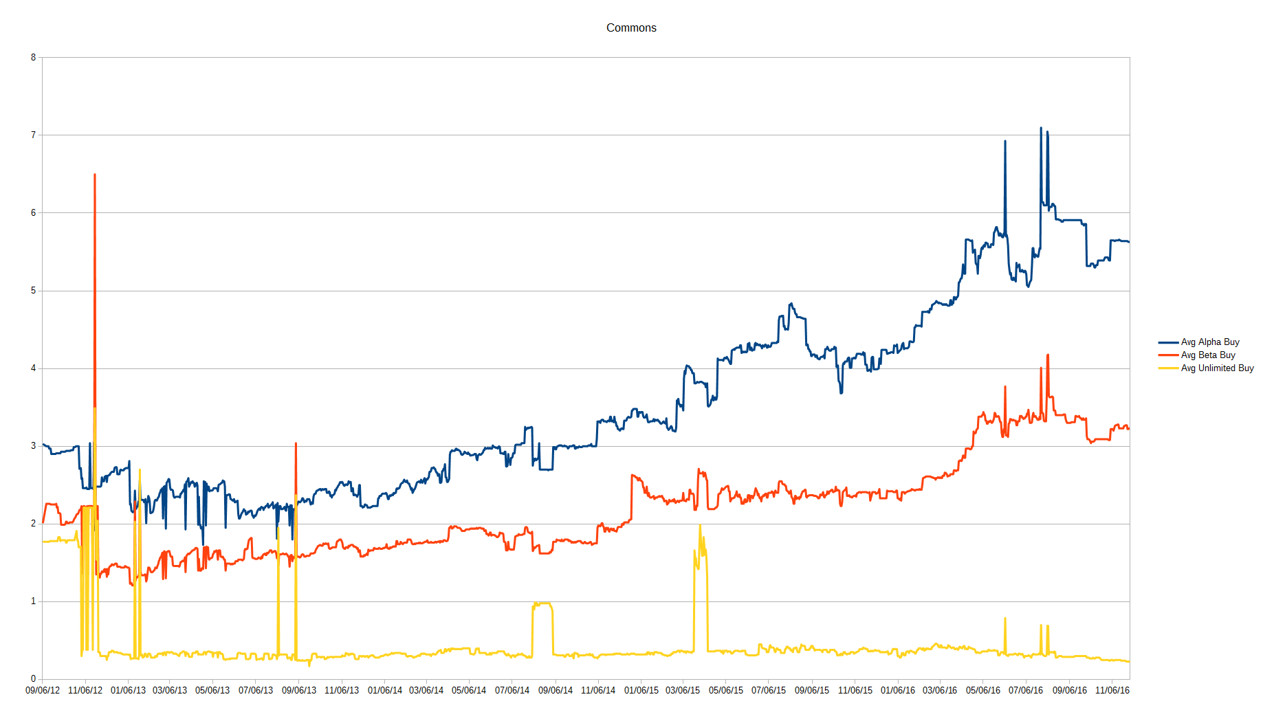
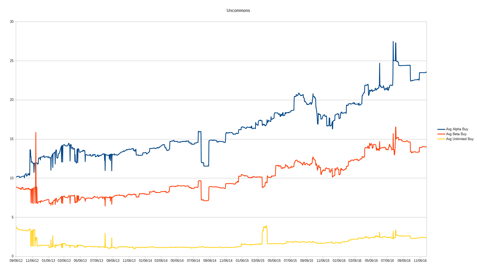
For the commons, Alpha and Beta behave similarly to what we have found, but Unlimited diverges. The other rarities however, especially the rares, do follow the same pattern across all sets. Based on this information, we can conclude that most individual cards from the original core sets behave the same way, with the exception of lower-rarity Unlimited cards. I would expect that the difference is caused by the considerably larger Unlimited print run.
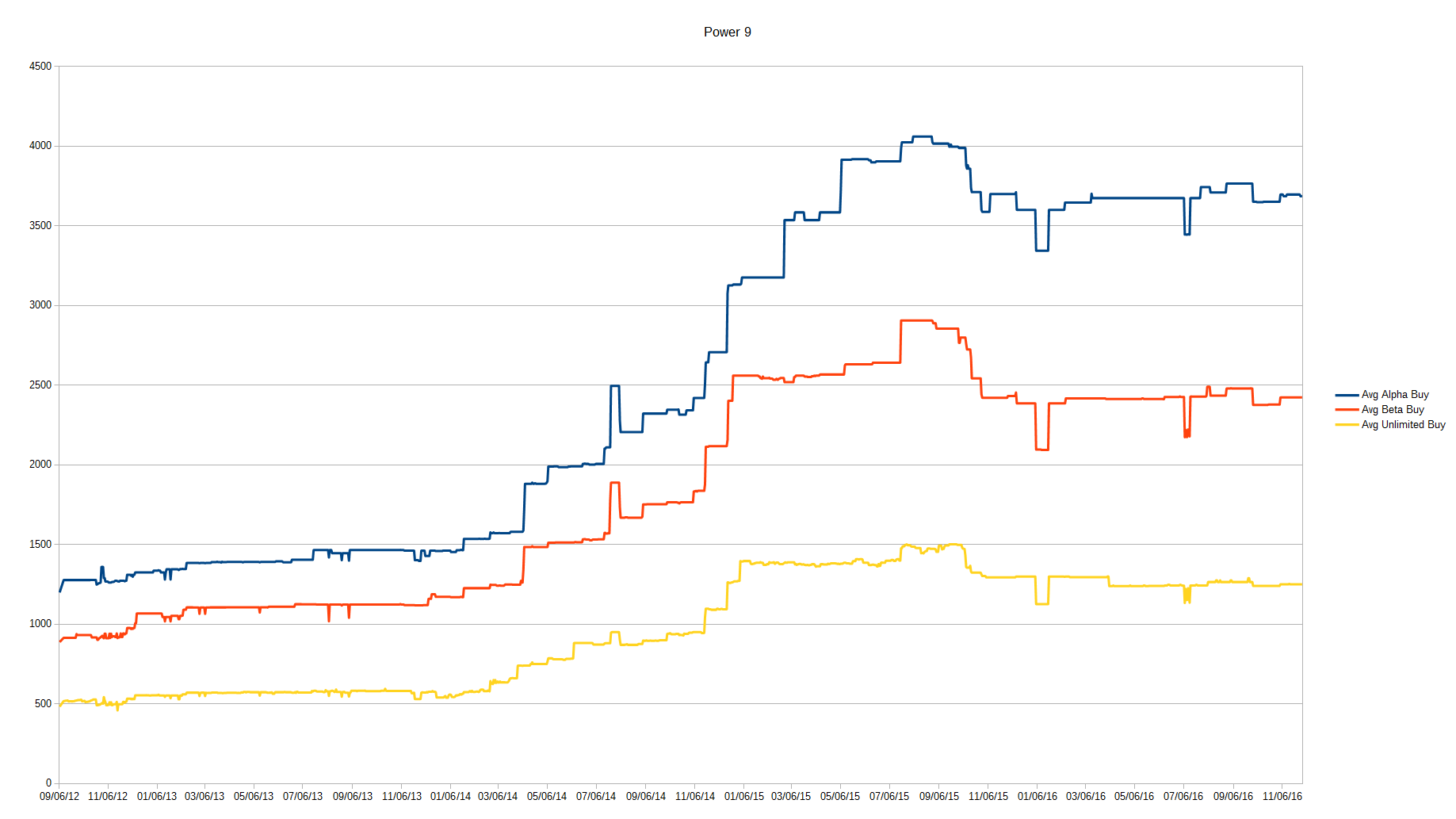
At this point we could consider filtering out cards to see their relative influence on the data—as I want to cover other datasets too, I'll leave that for another day. I will, however, show you the graph for the Power 9, which lines up very well with the total graph we started with.
Reserved List Cards
What if we wanted to buylist a single copy of every card on the Reserved List? Glad you asked.
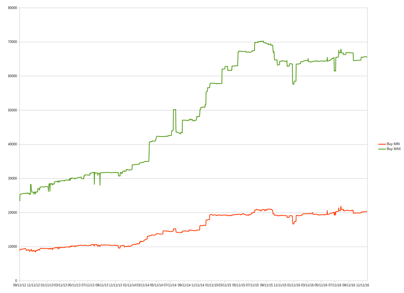
We all believe that Reserved List cards increase perpetually in price, don't we? Funny thing: apparently they don't!
What we're seeing here is that if we sell a single copy of the cheapest version of every card, the total increased from about $10,000 to about $20,000 in 2014—after that, though, the price has held more or less stable at $20,000. If we look at the line for the most expensive copy of each card, we see a gradual rise right up to July 2015, but after that the price drops and then remains more or less stable around $65,000.
It's clear from this graph that holding the fancier versions has given better results, but also that we've reached a plateau. This means that Reserved List cards are still stable to trade into, but they may not be your best investment if you intend to hold for gains.
Legendary Creatures
Now let's look at a data set that isn't skewed by Power: legendary creatures (referred to from here on as "legends" for brevity). I've elected to use the average price, as the graph for total prices would be skewed by every new set release. Foils are omitted.
Again the two lines show minimum and maximum prices for the average legend. A few legends have been reprinted, which accounts for the difference between the minimum and maximum lines. They clearly show the same behavior, though. I have no idea what's going on at the beginning of the graph (perhaps a TT glitch), but in any case I believe it's not very relevant today.
What's interesting is that for the past three years we've been seeing a bit of a pattern: the graph hits a low point, then starts rising up to a peak, after which there's a gradual drop again until the pattern repeats. The peaks seem to roughly align with set releases: Journey into Nyx, Dragons of Tarkir and Shadows over Innistrad.
I could definitely see that with their relatively large number of legends, Journey into Nyx and Dragons of Tarkir both encouraged players to pick up older legends. I could also see that the legends from those sets themselves perhaps buylisted a bit higher in the beginning. Innistrad block had some great legends, so it would not be unthinkable that, despite Shadows over Innistrad not having exceptional legends, it caused additional interest nevertheless.
We could also be seeing something else—perhaps the start of the rise is more important: January. Did players get some money for Christmas and start spending it at the beginning of the next year? Did they perhaps get the new Commander decks as a gift and start extending those? Do the shops know their budgets for the next year and increase their buy prices accordingly?
Or possibly the time it starts dropping is more interesting—does it go down because interest in legends (and perhaps Commander) fade when the weather gets better? There are clearly many ways to look at this data.
Regardless of the cause(s), the pattern is clear: soon the price of the average legend should start rising again, likely peaking between March and May and then dropping down for the rest of the year. Now may very well be the time to buy underpriced legends, in order to sell them when they peak in a few months. Due to the large data set, this obviously says little about specific legends, so put some thought into which you decide to pick up.
I must point out the other pattern that we see here. Both the highs and the lows seem to be gradually coming down. This makes sense to me as a casual player. Wizards is releasing more and more legends, thereby making players spread their Commander money among more cards. They're getting released at such a pace that we just can't start on new decks quick enough.
It's not that we're seeing the death of Commander—as far as I can tell it's as healthy as ever—but rather that Wizards is going overboard with the number of legends they print. Many recent legends have ended up as bulk rares, thus bringing down the average too.
Magic as a Whole
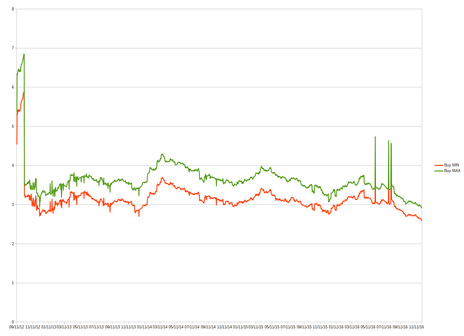
Of course the ultimate chart to look at is how Magic is doing as a whole. I should point out that some cards will not have buylist prices. Again I'm removing foils and using the average price to avoid the problem of new sets skewing the data.
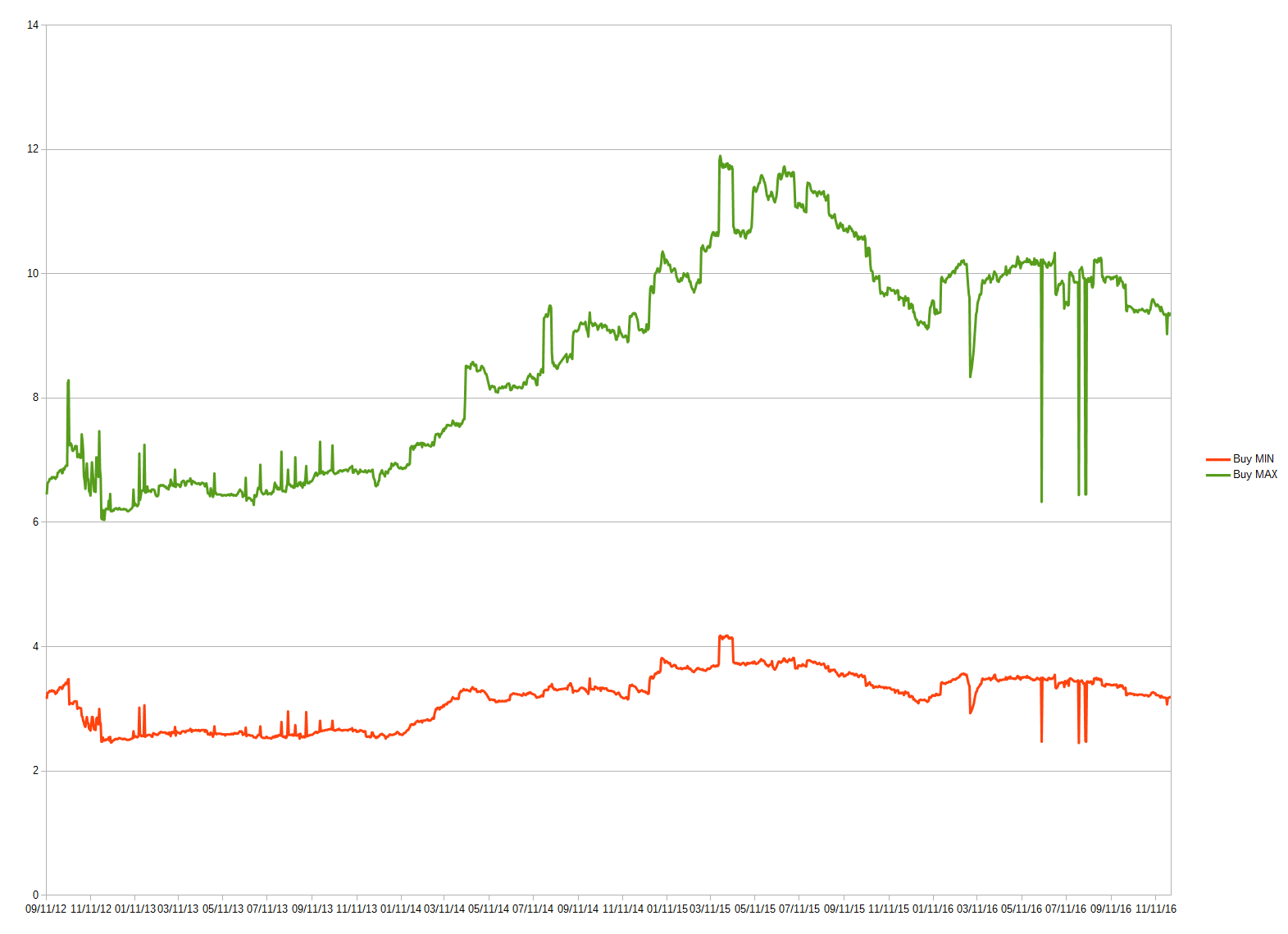
There are currently about 16,500 unique cards in Magic. If you own the cheapest copy of each in NM condition, you can buylist those for at least $3.19 x 16,500 = $52,635. If instead you own one of each of the most expensive copies in NM condition, you'll get a whopping $9.36 x 16,500 = $154,440. Both those numbers are definitely way more than I was expecting!
They are also very wrong—I wanted to show how statistics can be misleading. Buylist prices exist for only about 8,250 cards. It would be more fair to assume that the cards you can't buylist are basically worthless, halving those numbers. This gets us $26,318 and $77,220 respectively.
Okay, on to the chart. In February 2014, we see the cheapest version of the average Magic card start to rise to about $3.20. The highest point was a brief and exceptional spike above $4, but more usually the high points sat around $3.80. We also see the average price dropping slowly in recent months.
As for the latest dip, I don't think we have enough data to draw conclusions. It only constitutes a couple months' worth of data, and we saw the price recover at the beginning of previous years.
Looking at the price of the most expensive versions, we see a more profound rise between January 2013 and May 2015. We then face a quick drop, followed by the same seemingly stable period the cheap cards exhibited. The graph likewise goes down at the end, but again I'm not sure we can draw conclusions based on it. My best guess is that we'll return to around $10 sometime next year, but I would not put my money on it.
Until Next Time
I hope you've enjoyed joining me as I went off the deep end with graphs. As you can see, looking at aggregate data like this can give us some insight into broader trends in Magic finance.
Of course, there are tons of ways we could break down and organize the data available on Trader Tools—who knows what we could learn! With that in mind, I may revisit this topic in a future article. Let me know in the comments if you have any suggestions for interesting data sets to analyze.

I love the quantitative analysis, thanks for sharing.
Do you feel there’s any chance of using this past performance to predict the future? I think the past and future are correlated but the former cannot be used to predict the latter. This may seem paradoxical, but perhaps the larger the time gap the poorer the correlation. Thus the short term behavior can be predicted but longer-term extrapolations are much more befuddling.
What do you think?
Sigmund are you referring to time-series modelling? From price levels data we can transform into data series for daily, wkly and mthly returns, which could be tested for certain statistical properties and fitted into time-series models like ARMA/ARIMA to mechanically test for any predictably in returns, as well as compare which time gap version of the model has better prediction power than others.
The downside with time series models is only very short look-ahead predictions would have any meaning, as longer term predictions simply dampen off to the average return.
This is a downside because such aggregate data in my opinion is suited for long term investment, so short-run predictions are less useful by nature.
That first paragraph is pretty much ‘abacadabra’ to me. I think I understand a little bit of the rest, but not much.
I don’t have a background in this stuff, but if you could help me understand what you’re looking for I would be happy to see if I could put it together and even try to say something meaningful about it. Feel free to PM me on the forum (my “pi” account please). Understand that I will not be familiar with the specific terminology, however I do have some understanding of data.
Well, I see a clear pattern in the Legends data. I believe we should see an uptick in value for the average Legends start soon. Of course that’s fairly sort term.
I also think it makes sense that the further away you go the harder predictions for it will be. This isn’t to say you can’t make any predictions at all, but you’ll be less accurate in regard to when it’ll happen or how it will happen. For example, I believe that when there’s a Magic movie it will draw people to the game. I don’t know when this will come about or how many people it will draw in, but that doesn’t mean I can’t prepare for the eventuality.
About “Average Magic card buylist price” = I believe the peak towards end 2015 is most probably caused by the influx of all the additional vendors trying to get their buylist competitive (= increasing avg price).
Once that is more or less settled, the avg buylist price can only go down –> all newer cards will never be able obtain a high buylist price compared to the top 500 in this list probably. How many of the cards used in this index are worth $25 for instance? How many new standard cards will ever reach such a high buyprice? Hence the more newer sets the lower this avg buylist price should be (stagnating to a more and more constant plateau sure…)
It’s actually going down towards the end of 2015? The date is in American notation with the month at the front. Do you perhaps mean the peak midway through 2015?
As the average card price seems to align strongly with the Reserved List graph when it comes to the peak I believe that this rise has had a strong influence during this period and that then as you suggest many new cards start bringing the average down again.